About the Coins
Appreciating Celtic Coins (Info)
Appreciating Celtic art requires some effort because of its abstract nature. The images embody extreme distortions of reality, often with a dreamlike quality. To complicate matters, the Celts enjoyed concealing images-within-images, so the total idea can be grasped only with scrutiny and attention to detail. It is often possible to view a coin many times, only to discover something new on a closer look. You almost have to take the approach you use when analyzing puzzles of the "find twenty-eight things wrong with this picture" variety. Appreciating Celtic coins requires more concentration on the part of the viewer today, because we are not accustomed to looking at images so closely. You will be repaid many times over, however, for making the effort.
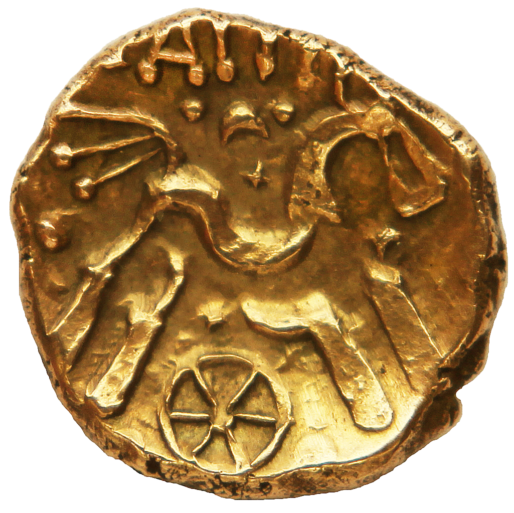
The following is an analysis of a Celtic coin-image, selected because it is not only a good example of Celtic art, but is also typical of what the coins offer. The coin is unusual in one respect: the dies and the flan were nearly matched in diameter, and as a result, almost the entire image is present. Most Celtic coins carry only about two-thirds of the die-image, because the dies were normally much larger than the flans. Often, to see an entire image, several coins must be viewed – a process leading to discovery after discovery as new coins turn up.
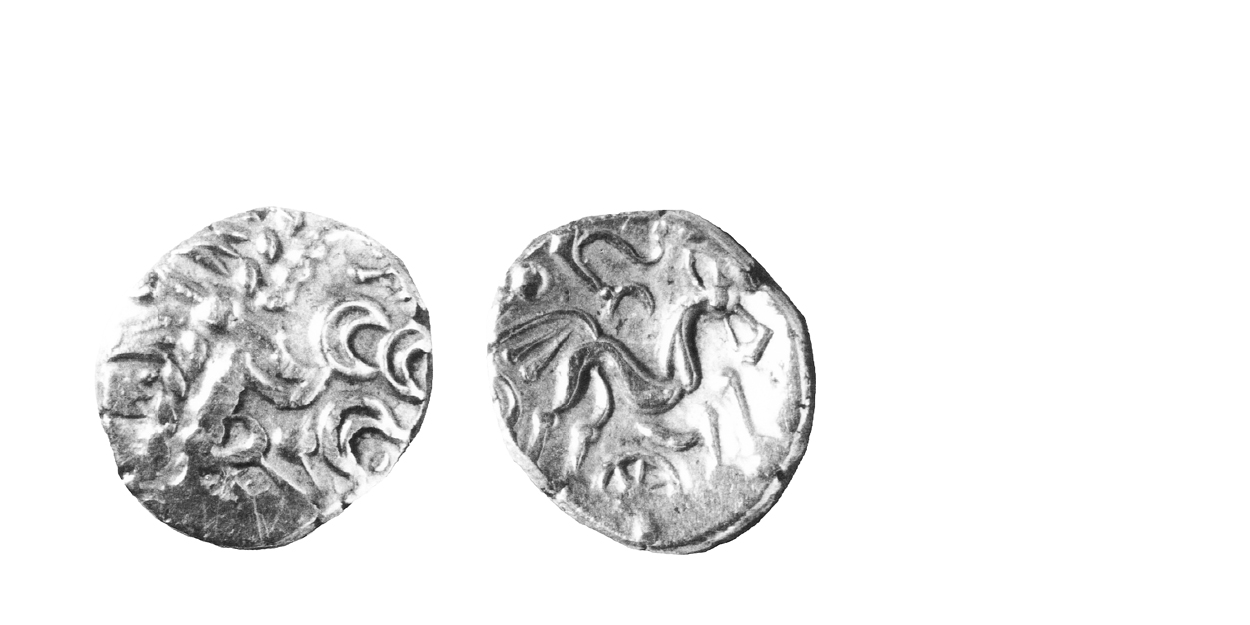
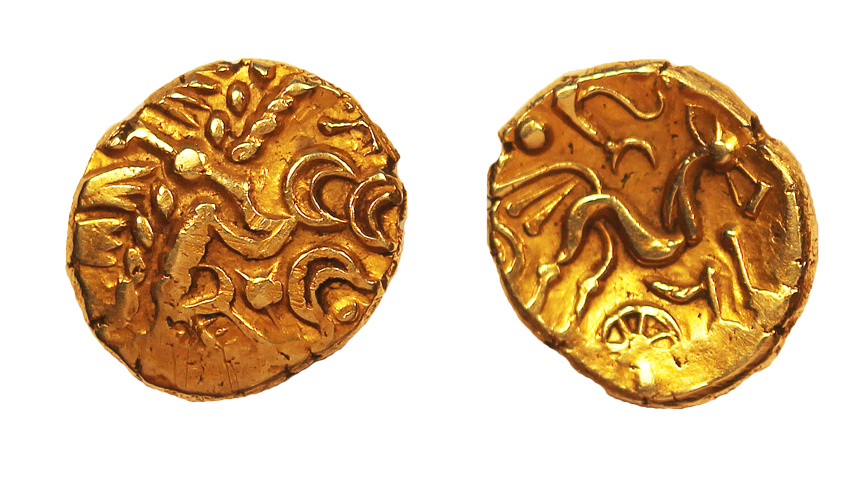
The coin is an Atrebatic Abstract Type stater, struck late in the Gallic War or perhaps slightly afterwards. The design is several adaptation/copying steps from the Macedonian Philippus and the horse-and-chariot design has become completely abstract.
But in what sense are they "abstract"? While the artist who cut the dies for the Philippus was trying to portray a horse and chariot at full speed, the Celtic engraver was obviously after something else. The engraving does not suffer from a lack of skill the die cutting is carefully executed – the engraver has created exactly what he wanted.
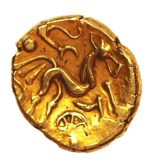
Our first impression of the image is of an animal trotting across the coin in a spirited and graceful manner. The area around the horse is filled with unrelated objects appearing out of place and giving the image a dreamlike quality.
A detailed inventory of the objects in the image is necessary at this point. The animal, a horse, has its legs spread apart as if it was leaping. The horse's knees are made up of pellets and the hooves are small wedges. The image is a stick-figure, but the body is thickened and formed into a swayed-back shape. The tail is represented, surprisingly, by three lines, each ending in a pellet. The nose is a triangle, the head a large pellet and the ear an ellipse. Below the horse is a spoked wheel floating in space and behind the animal, part of an ellipse. Above the horse appears a series of curved lines, the remnants of the chariot driver's arms on the Philippus.

How does the form of this image create the impression of a graceful animal trotting across the field? The artist has succeeded by creating a repetition of details, while carefully avoiding monotony. The image is one of near-balance, made of non-symmetrical elements. The lack of exact balance and the inexact repetition causes the viewer to feel tension, and this in turn creates the feeling of motion. First, note none of the lines is a radius of the coin – none would pass through the centre, if extended. Any line, if made a radius, would have ruined the design. made it monotonous.
The horse's back and rear legs lean forward giving the entire image a motion to the right. The motion is balanced, but not stopped, by the left-leaning front legs. The tail has been made triple to increase its mass and thus balance the head, nose and ears. The pellet above the tail skillfully balances the pellet of the head, but being slightly above, increases the motion to the right.

We enter the design at the tail, because the repetition of the strands immediately commands attention. The tail picks up the observer's view and casts it up to the arms of the rider, which in turn sends it to the nose. The end of the nose brings the eye down to the curves of the wheel and the belly of the horse. These, in turn, send the eye back to the tail, where the entire process is repeated. Thus, the viewer's eye is carried round and round in a clockwise direction, enhancing the impression of vivid motion. The major elements of the design balance nicely, but there is a preponderance of motion to the right, created by the lean of the body, the pointing head and the arms of the rider.
The artist has created the impression of an animal in motion, and has done it with great skill. While the viewer may not like the image, one is forced to admit it works admirably – and this is the essence of art, the ability to create an impression in the mind of the beholder. The artist has hidden the physical appearance of a horse, and has instead portrayed only its graceful motion. This is the process of abstraction and the Celts were masters of it.
Next section – Semiotics
